Essay · Origin
From stone scripts to fluid lines
↳
Fusing Persian & Middle Eastern calligraphy with minimal silhouettes, By Foad Memariaan explores how script, sound and silence can live on fabric, paper and screen without translation.
Hand-drawn calligraphic compositions translated into tees, oversized cuts and accessories — designed to feel like a fragment of a poem you can wear.
Original designs across Etsy, Redbubble, and music platforms, plus custom work on request for galleries, brands and collectors.
I do not design logos on shirts. I choreograph strokes — pauses, breaths, unfinished poems — until they become objects you can live with.
The work is rooted in Persian calligraphy and Middle Eastern visual history, but it is not nostalgic. Script becomes architecture; letters break apart into rhythm, weight and texture. The result is a language that can be worn by anyone, whether they read the alphabet or only feel its sound.
Every piece is an invitation: to notice detail, to slow down, to carry a fragment of culture through a world that scrolls too quickly.
The story of what we now call “Persian calligraphy” does not begin with a pen. It begins with stone. In the Achaemenid period, royal proclamations were carved in cuneiform — vertical and diagonal marks cut into rock to make language permanent. Those scripts were heavy, architectural and closer to sculpture than handwriting.
Centuries later, the arrival of Islam brought the Arabic script into the region. Scribes adapted it to the sounds of the Persian language, shaping styles that were both legible and increasingly elegant. Over time, this gave birth to forms like Naskh for clarity and Thuluth for monumental inscription. Eventually, in fourteenth-century Iran, the script known as Nasta‘liq appeared — a synthesis of precision and lyricism that many historians now describe as one of the most refined achievements of Persian visual culture.
In Nasta‘liq, words no longer march in rigid rows. They float. Letters lean into each other, arcs rise and fall, and the baseline itself becomes a wave. Poems by classical writers were copied in this hand for centuries; each verse became both text and image. When we look at a historic manuscript today, we are seeing not only literature preserved, but performance frozen on a page.
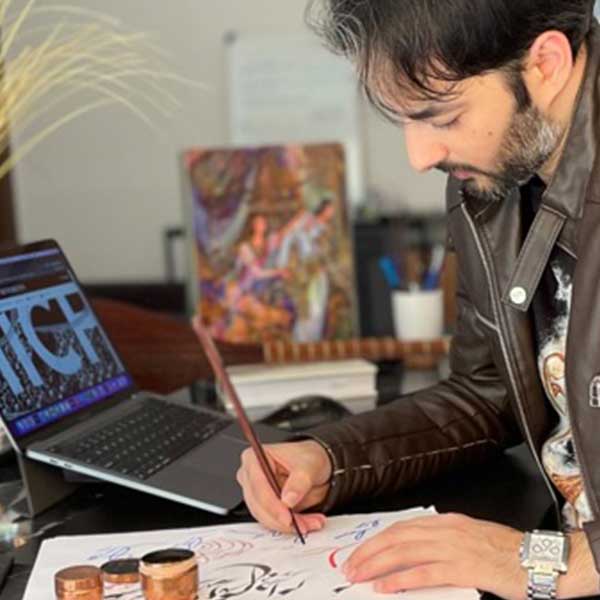
My own work doesn’t attempt to imitate those masters. It borrows their sense of gravity and weight. Every curve of a letter has a center of mass. Every slash, every thin stroke, should feel as if it could have been carved into stone even when it lives on cotton.
When I draw for a shirt or a digital piece, I often imagine the earliest scripts behind it — the noise of a chisel, the dust, the public square. If a form feels too decorative, I strip it back until it could plausibly survive on a wall for five hundred years. Only then do I let it rest on a garment for a season.
In recent decades, many Iranian and diaspora artists have treated calligraphy less as language and more as raw material. In galleries you’ll find canvases where Farsi characters have been stretched, rotated and layered until only their energy remains. You recognise the alphabet, but you can’t quite read it anymore.
Some painters extract fragments of poems, then repeat a single letter until it becomes a pattern. Others erase parts of words so that only accents and dots float in the field like constellations. Viewers who do not speak the language can still feel the density, the tension between curved and angular strokes, the sense of compressed meaning.
This move from text to abstraction is not a betrayal of calligraphy; it is a continuation of what it always did. Historically, master calligraphers arranged lines of poetry in complex compositions: diagonals crossing, words woven into shapes that border on geometric design. Today’s abstract works simply push that logic further, into a space where reading is optional but resonance is not.
When I design a piece of clothing, I think of it as a small gallery wall that moves. The calligraphic composition must hold up as a painting first: balance, negative space, rhythm. Only afterwards do I ask what the word actually says, or whether it even needs to be legible. Sometimes a single word like “love” or “nothingness” is enough; other times, the word dissolves and only the skeleton of its strokes remains.
The goal is to create garments that feel like fragments of a larger installation — tokens from a museum that does not yet exist. You do not need to understand every layer of text to feel that you are wearing part of a structure, a piece of silent architecture drawn in ink.
In many historic Iranian spaces, the written word is also the main ornament. Mosque walls are layered with Qur’anic verses; ceramic tiles carry bands of script that run like ribbons around doorways; metalwork and bowls are edged with phrases that function both as decoration and blessing. The letter is never just a mark — it is pattern, protection and presence.
The same logic appears in domestic objects. Plates, textiles, carpets and even jewellery often host small phrases: invocations, lines of poetry, names. Calligraphy wraps around the wearer or the room, tracing a soft perimeter of meaning. To live inside such an environment is to be surrounded by language even when you are silent.
Contemporary design studios have extended this tradition into modern interiors. Calligraphic prints hang as large canvases; cushions, bags and tiles carry stylised scripts in gold, black or deep ultramarine. Online collections of Persian-inspired design show how a single word can anchor a whole room when placed with intention.
My interest lies at the border between these worlds — between a museum tile and a hoodie, between a manuscript page and an oversized tee. When I place a calligraphic piece on fabric, I think of how it would behave if it were instead carved above a doorway or printed on a ceramic panel. Would it still feel balanced? Would it still hold the eye from a distance?
This is why many of my layouts leave generous empty space. The design is not fighting for attention with twenty other graphics; it behaves like an inscription that understands the architecture around it. Your body becomes the wall. The city becomes the gallery. Everyday movement activates the script.
A new generation of artists treats calligraphy as both heritage and software. Tablets, vector tools and motion graphics sit next to reed pens and ink. The gestures may be drawn on glass instead of paper, but the underlying questions remain the same: how do you balance weight and emptiness? How many strokes does a letter truly need?
Digital environments have opened calligraphy to new types of movement. Letters can fade, rotate, fragment and reassemble in time. A single composition can exist as a still print, a looping video and an interactive layer in a website. Global audiences encounter these works without necessarily knowing the language — they respond to tempo and contrast rather than grammar.
As someone who designs for both fabric and screens, I see no real boundary between these mediums. A calligraphic drawing might first appear as a motion test in a video, then become a static graphic on a shirt, then live again as a layered texture in a digital collage. Each version teaches me something about the core form: where it breaks, where it holds, where it can be simplified.
At the same time, global distribution platforms have turned local scripts into shared visual vocabulary. A shirt created in one studio can be worn in cities that have never heard the original poem it references. That is both a responsibility and an opportunity. I try to keep the work honest to its roots — acknowledging the history of Persian and Middle Eastern calligraphy — while allowing it to adapt to new contexts without anxiety.
Ultimately, tools will keep changing. AI models will generate convincing imitations; new display surfaces will appear. What matters is the pulse underneath: the human decision of where to pause, where to push harder, where to leave silence on the page or cloth. That is the part no software can fully automate — and the part I intend to keep drawing by hand.